I can’t stand it when service providers who do good work, have outdated websites that ruin their credibility.
I’ve always seen life through a lens of beauty and order.
Whether meticulously organizing my childhood ninja turtle collection, customizing my high school basketball shoes with colors and designs no one else had, or building websites, I’ve always had an eye for making things clear and beautiful.
Helping my clients find clarity and making their online presence look and sound awesome is what I love to do.
Too many service businesses lose credibility with an outdated website.
That’s why I started Clear Sight Design and became a StoryBrand Certified Guide. I utilize a proven marketing framework that gets results for my clients. When clear messaging is joined with good design, magic happens.
Ready to get started? Your audience is waiting…
-Andy
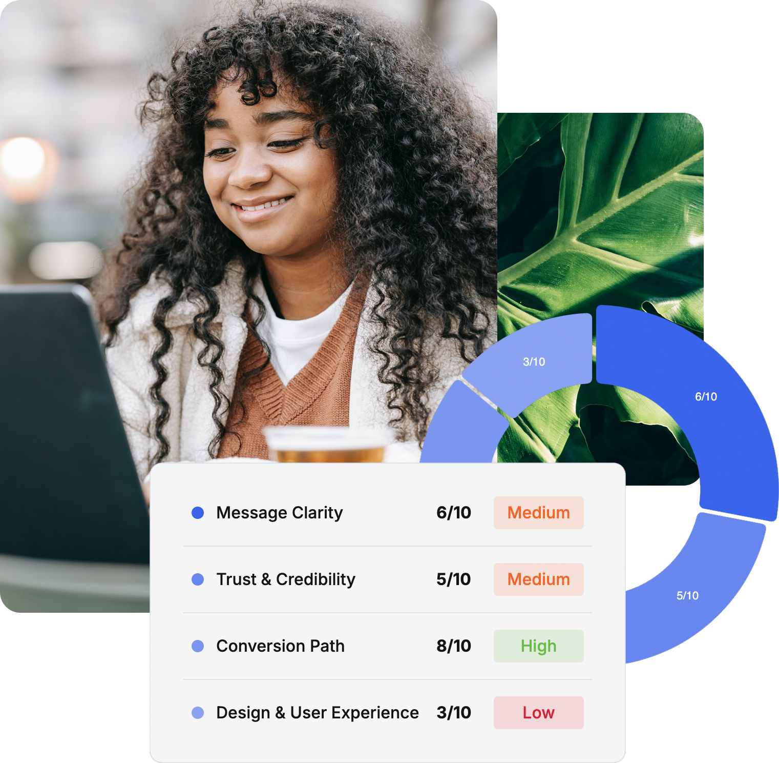
Is your website less professional than you are?
It's not fair, but it's true:
Your website visitors judge your credibility by the quality of your website.
Are you sending the wrong first impression?
Take the 2-minute quiz and get instant access to your Website Credibility Score plus strategic recommendations.